
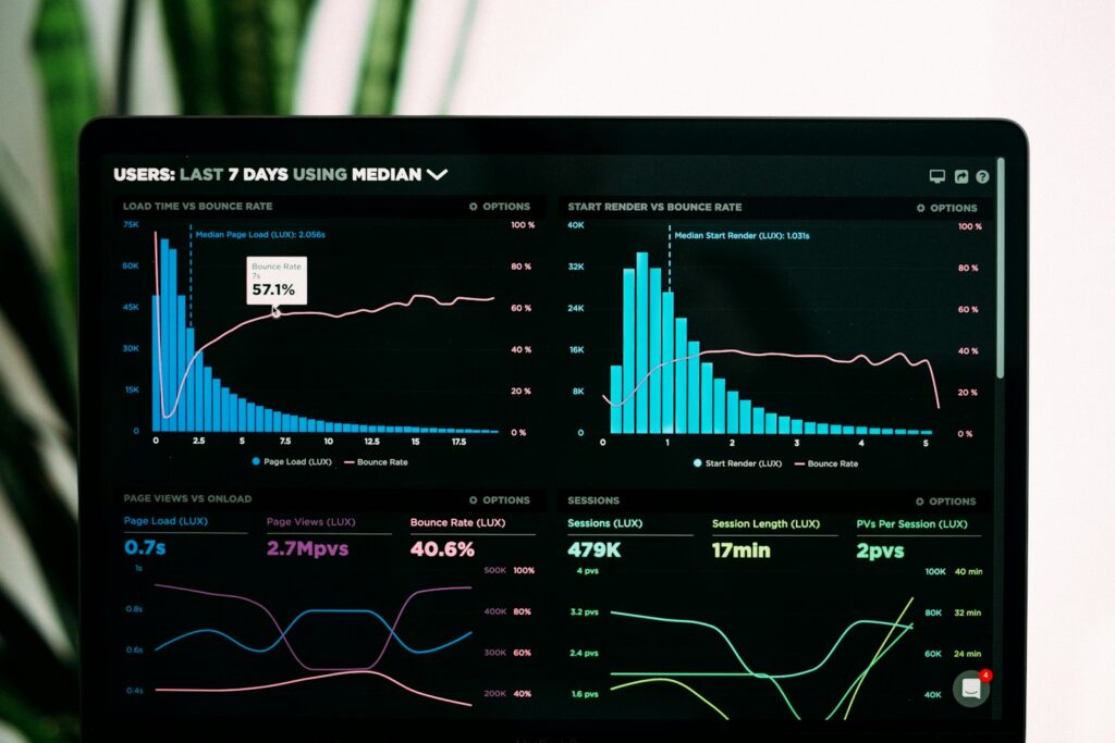
A well-designed dashboard is the tool that turns a club’s data into decisions.
“It’s been a good month” or “the lessons are working” are phrases often heard in a golf club’s management meetings, and they are rarely backed up by a number. Management by intuition has taken many clubs a long way, but beyond a certain size, especially in clubs with more than 2,500 members, it is no longer enough.
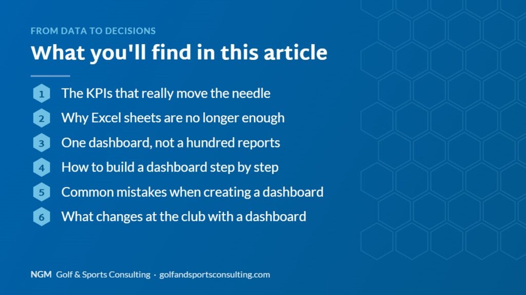
The KPIs that really move the needle
Not every indicator deserves a place on the management dashboard. The ones that make a difference in a golf club are real course occupancy by time slot, average revenue per member and per visitor, the acquisition cost of each new member, the membership renewal rate and the weight of each business area (green fees, lessons, F&B, events) in total revenue. With these five figures, up to date and on the same panel, management can take decisions in weeks that used to take whole seasons to confirm.
Why Excel sheets are no longer enough
The problem is not measuring: almost every club already generates this data somewhere, spread across the booking system, the accounts, the restaurant’s point of sale and spreadsheets that each department updates separately. The problem is that nobody sees it together in time. When July’s occupancy figure is cross-checked with October’s F&B revenue, the decision that could have been taken has no margin left.
One dashboard, not a hundred reports
The difference between having data and managing by data lies in centralisation: a single dashboard that combines bookings, fees, events and catering in real time, accessible from management’s phones, without depending on someone preparing a report at the end of the month. It is not about producing more reports, but about always having the same five or six correct numbers at hand, effortlessly.
How to build a dashboard step by step
Creating a useful dashboard does not require big projects. These are the steps we recommend:
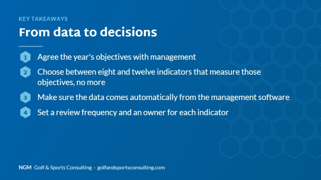
- Agree the year’s objectives with management: occupancy, revenue, satisfaction, costs.
- Choose between eight and twelve indicators that measure those objectives, no more.
- Make sure the data comes automatically from the management software.
- Set a review frequency (weekly for operations, monthly for management) and an owner for each indicator.
Common mistakes when creating a dashboard
The most frequent mistake is trying to measure everything: a dashboard with fifty indicators does not help anyone decide. Other common mistakes are relying on manually entered data, not explaining to the team what each figure means, or reviewing the numbers without taking decisions based on them.
What changes at the club with a dashboard
When the dashboard is really used, meetings become shorter and more useful, problems are detected earlier and conversations with the board or the owners are based on data rather than impressions. The team also better understands how its work contributes to the club’s results.
Frequently asked questions about the dashboard
Which tool should we use for the dashboard? Ideally the club’s own management software, which avoids duplicated data and errors.
How often should it be updated? Operational indicators daily or weekly; strategic ones every month.

An example of a monthly dashboard
A simple dashboard for the monthly management meeting can include occupancy by time slot, average revenue per round, catering and shop revenue, maintenance costs, new members and cancellations, and a satisfaction index. With just these figures, compared with the previous month and with the same month last year, management can spot trends, prioritise actions and clearly explain to the board or owners how the club is evolving.
At NGM we design the dashboard the club needs together with its management, connect it to the tools it already uses and train the team to use it regularly in meetings and decisions.
From management to the club’s day-to-day
When KPIs are centralised, they stop being just a management tool and start guiding operational decisions: adjusting off-peak green fees according to real occupancy in recent weeks, adding restaurant staff on days with more events planned, or prioritising the renewal of members who use the facilities least before they leave.
This is not an idea exclusive to golf: every sports federation, including the Royal Spanish Golf Federation in its own management reports, stresses the importance of measuring before deciding, and a well-defined KPI dashboard is the most direct way to apply that principle to any club’s daily operations. At NGM Golf & Sports Consulting we build these dashboards into our management software, combining bookings, fees, events and catering in a single panel, so that management always has the same correct numbers at hand instead of rebuilding them every month from spreadsheets scattered across departments.
With that combined view, adjusting prices or adding staff at the busiest times no longer depends on intuition and is based on figures that can be checked every week. We help golf club management teams build their KPI dashboard from the data Total Management already generates, without adding manual reports. If you want to know what your own numbers would tell you if you had them all together, let’s talk.